Telephone Consultation(Inquiry)
If you have any questions, please contact the contact information below.
(+82) 43-212-5053COMPANY
Introduction of CI
WORD MARK
The GSTEC word mark is an important visual representation that conveys the company's image. It is crucial to follow the guidelines on minimum size when using the word mark to ensure it remains legible when reduced in size and to prevent any improper use.

GRID SYSTEMS
GS TEC's word mark is a crucial component in expressing the company, and it is important to understand the contents of this section when using it to prevent any cases of misuse. The grid regulations for the word mark are based on the data contained in the guidelines, and in unavoidable circumstances (such as when larger sizes are needed, such as for large signs, or when manual work is required), it is necessary to comply with the grid regulations to ensure that errors in the basic form do not occur.

Logotype_Korean
The Logotype_Korean is used to represent the official name of GS TEC. It has been created with considerations of consistency with the word mark and readability, so it should not be altered or modified and the data in this manual should be used when utilizing it.

SIGNATURE
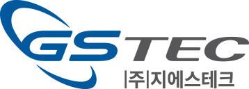
The signature is a combination of the word mark and the logotype in Korean, and it is most aesthetically pleasing when the arrangement of the two elements is harmonious. It is important to pay close attention to the position and proportion of each element in terms of usage and management.

Exclusive Colors
Exclusive colors play a crucial role in differentiating GSTEC. It's crucial to consistently and accurately use the designated colors in all applications. The expression of exclusive colors should use CMYK 4-color process as a principle, but spot colors may be used depending on the medium. It's important to follow the color guidelines outlined in this manual when applying the exclusive colors.
Main color
GS TEC
BLUE
- PANTONE 285C
- CMYK 100, 55, 0, 15
- RGB 0, 88, 161
GS TEC
GRAY
- PANTONE 424C
- CMYK 0, 0, 0, 80
- RGB 89, 87, 87
Sub color
GS TEC
MOTIF BLUE
- PANTONE 299C
- CMYK 90, 40, 0, 0
- RGB 0, 121, 195
GS TEC
MOTIF GRAY
- PANTONE 427C
- CMYK 25, 20, 20, 0
- RGB 201, 199, 197
